
Build Accessible Paid Social Creative for Local Auto Shoppers
Accessible creative is not a final checkbox. Make the message understandable across sound, screen size, contrast, language, and motion.
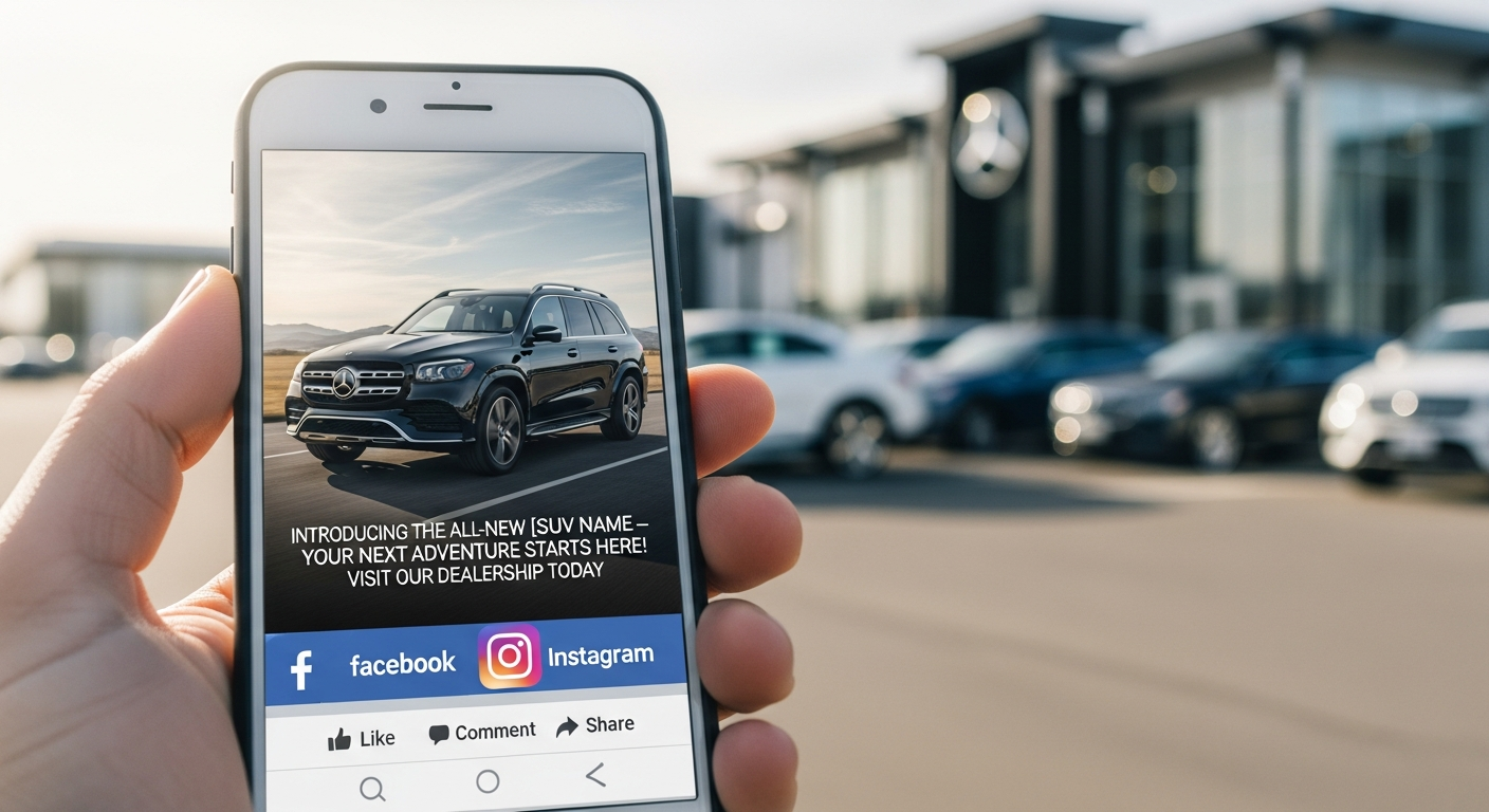
A local shopper may encounter a dealership ad while their sound is off, their phone is in bright sunlight, their connection is slow, or their attention is divided. A viewer may rely on captions, a screen reader, larger text, or a clear written description to understand the offer. Accessibility is therefore part of paid social effectiveness and customer respect, not a special treatment added after the creative is finished. The work starts by making the core message survive the ways people actually encounter a feed.
Protect the Meaning First
Write the essential message as plain text before creating motion or overlays. Identify the vehicle or department, the customer benefit, the condition that changes the claim, and the next action. If an image carries information that is absent from the copy, add a useful description or revise the composition. Do not rely on color alone to distinguish trims, payment options, or a button-like instruction. A visually dramatic frame can still be an effective frame when its meaning remains available without guessing.
For video, caption spoken words and important sound cues. Place text in a safe area that survives common crops and does not cover the vehicle detail being discussed. Keep captions synchronized and review them for model names, prices, and service terms that automatic transcription can misunderstand. A concise cut often serves more people than a long edit with tiny type. If a fast montage is central to the idea, provide a slower or static version with the same customer information.
Design for the Smallest Real Placement
Preview the asset on an ordinary phone and ask someone to read it at a normal distance. Check contrast against the actual background, not a flat proof. Test the opening seconds without audio, then read the caption and destination copy as a single message. Keep the call to action explicit rather than embedding it in a decorative button that may be cropped. The goal is not to eliminate visual style; it is to make style serve recognition, comprehension, and a fair opportunity to decide.
- Provide captions for spoken content and review names, numbers, and offer terms manually.
- Keep essential text large enough and high-contrast enough for the intended mobile placement.
- Use copy and descriptions to convey information that an image alone cannot provide.
- Avoid color, speed, flashing, or tiny disclaimers as the only way to communicate meaning.
- Check the ad, form, landing page, and confirmation for the same accessible promise.
Include People in the Review
Production teams can catch technical errors, but real viewers reveal whether the message is understandable. Invite a service advisor, salesperson, and a person who was not involved in production to review the asset. Ask them to describe the offer, the vehicle or service context, and the next action with sound off. If possible, include feedback from people with different access needs through a respectful, compensated review process. Do not ask one person to represent every viewer or treat accessibility feedback as an aesthetic disagreement.
An Accessibility Release Checklist
Before launch, save the text transcript, captions, image description, final copy, and destination review with the campaign record. Confirm that the important terms are readable in the smallest placement and that the form can be completed without an unnecessary barrier. Recheck assets when a platform crops or a promotion changes. Accessible creative is not a guarantee that every person will engage, but it is a disciplined way to avoid making a local invitation harder to understand than it needs to be.
FAQ
Are captions only needed for video?
Video captions are essential for spoken content, but accessibility also applies to static images, carousels, forms, landing pages, contrast, and the clarity of the written offer.
Does accessible creative have to look plain?
No. Strong contrast, clear hierarchy, thoughtful composition, and useful descriptions can support a distinctive brand. Accessibility asks the design to preserve meaning, not to remove personality.
Want to implement these strategies?
Relevant Dealer can run this exact playbook for your operation.
Talk to an Operator